An Exhibit Worth Seeing
April 14, 2013
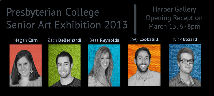
From bathtubs to caveman idealization to Lilly Pulitizer to horses, the Senior Art Exhibit of 2013 is far from typical. This years’ art exhibit features Joey Lookabill, Megan Carn, Nick Bozard, Bess Reynolds, and Zach DeBernardi. Each artist brought to life their inspiration and passions through their unique exhibits. The turnout for the Senior Art Exhibit 2013 opening reception was exceptionally high and gave all of the involved artists the recognition and exposure they truly deserve. As an attendant of the opening reception, it was incredible to get the chance to see the fruition of the exhibits that the seniors, no doubt, poured an incalculable amount of time and effort into.
Joey Lookabill presents PC with a unique, yet phenomenal installation exhibit. Through installation, Lookabill states his art “can begin to transform the gallery, not just occupy it.” His statement could not be truer. When walking into his exhibit, you enter into a new world, far from the typical gallery scene. His exhibit, which is focused on the human use of words, succeeds in exploring different aspects of the human language. His exhibit focuses on the inadequacies and challenges of words, when they fall short or when they go too far. His four installations represent different aspects of words and how we use and often abuse them. My favorite installation is his piece titled, “Coffee talk.” This installation includes a table and chairs with a heap of overflowing words in the center of the table, right between two coffee cups. On the wall behind the table and chairs are the words “Talk is cheap,” written with nails and string.
As Lookabill intends, this “Coffee talk” becomes so relatable to the human experience. How often do we truly sit down with someone and have a meaningful conversation? Dialogue is often masked by gossip, complaints, and other common place overused topics, none of which add to our relationships with one another.
Overall, Lookabill’s exhibit is truly defining of the challenges we face in communicating. His exhibit is in its own way very beautiful, and by far thought provoking, an aspect all artist thrive to achieve in their works.
Megan Carn has truly grasped the fashionable and lively designs that many southern women adore. Her art, which includes paintings, wall-paper, an upholstered bench, and fabric designs, resembles patterns and designs from the ever popular Lilly Pulitzer brand, but with her own special Megan Carn twist.
Carn states that the motto “too much is never enough” lies behind her art. This is evident the moment you step into her exhibit. The eyes are struck with bright colors, detailed patterns, and intricate designs. Her enjoyment comes from the struggle that lies behind pattern making; the precision, the thought process, and the difficulty in putting her own personal touch in each design. Her enjoyment in the face of difficulty is admirable and results in beautiful work.
When first seeing Carn’s work, I thought it may benefit her to move outside of flowers, girly patterns, and design. She is so talented and is so great with color it may behoove her to move outside of the Lilly Pulitzer lovers’ fan base. However, with a second thought, I realized that in her work, Carn has found her niche and place of effectiveness. Many people, especially at a college age level, search and strive to find the thing in which they make the biggest impact, where they are most effective, where they are desired and where they desire to be. Carn has found this place and will be an undeniable success in the designing market.
Nick Bozard’s exhibit is by far the most intense. His paintings reflect the inner most part of him. Bozard states that “each piece concentrates heavily on specific emotions [he] felt during different moments in [his] life. After reading his artist statement, which explained the depth that his personal experience influenced each abstracted piece, I began to appreciate his work on a deeper level than just at face value.
In art classes, professors will ask the students what his or piece ‘means.’ I often find that I create a piece out of pure desire to fulfill an assignment rather than to express my inner-self. Creating art is one thing, creating art with true expression is a whole new world; a world in which Bozard has completely grasped. Each piece is great; full of talent and artistic expression. But, even better is that each piece invokes curiosity on the viewer. I found myself asking “What is the story behind this?” or “I wonder what emotion lies behind this piece?” While Lookabill’s work invokes thought about the deeper meaning of human expression, Bozard’s takes the cake in provoking emotional thought.
Bess Reynolds’s exhibit features horse drawings, primarily done in the medium of contè. When walking into her exhibit, you may think, “Wow, this girl sure loves horses.” You would be right. In her artist statement, she even refers to herself as being “horse obsessed.”
Her work is the most realistic and displays the most ‘technical’ talent. That is, she knows how to properly use lines, shading, and all of the techniques needed to make something look neat, clean, and realistic. Her exhibit is simple, but not in a boring way. Despite the fact that I am terrified of horses, it is nice and peaceful, which is one of the reasons Reynolds uses horses as the main subject in her art; because that is where her comfort and peace lie.
Although Reynolds’ exhibit features absolutely beautiful drawings, I find myself wanting something more. She says she draws horses because that’s what she loves, and that she prefers drawing because drawing is where she is most comfortable. However, I think her talent has potential to reach greatly beyond drawing on flat pieces of paper. Like Megan Carn, she has found the subject in which she is greatly effective; horses. Unlike Carn, she has not branched out to different mediums, which would make the subject of horses more interesting to a greater audience.
My favorite piece of hers, “Robins Eternal” was the most attractive to me because it broke away from the other traditional horse drawings. This piece is a beautiful close-up of a horse’s eye. Although it is a drawing, she added a different medium, pastel, which added greater depth and color to her art.
Reynolds plans to draw people’s horses, a business she calls “Equine Portraits by Cullie.” Her drawing abilities and southern location will allow her to greatly succeed in this business.
Last, but certainly not least, is the most ‘truth filled’ exhibit of them all. Zach DeBernardi’s exhibit combines pre-historic cave imagery with contemporary subject-matter and media. He connects prehistoric man with contemporary culture, in order to help viewers understand their socio-cultural origins.
Although his exhibit attempts to bring viewers attention to self evident truths, his subject matter is not self evident to me at all. However, this could be due to the fact that I do not have a televisions to watch the news, I try to stay away from social-media networks, and I only read People magazine if I’m waiting in a doctor’s office. Fortunately, DeBernardi explained to me the meaning behind each of his pieces. His pieces range from truths about politics, celebrities, and athletes, to Facebook freaks and copy cats. One piece, called “Pollack is Shaking” has headphones beside it that has the popular Harlem Shake playing on repeat enough times to play for a solid month.
Prior to grasping DeBernardi’s concept, the medium he used for his exhibit stuck out to me as unusual and highly effective in portraying caveman and modern imagery. Each piece is on a flat piece of wood, either a door cabinet, a door, or any other type of found rectangular wood. DeBernardi then piled them up with layers of plaster, painted them, and then topped them off with his own drawings and paintings or printed pictures of people and objects. It sounds crazy to describe, and it is crazy to look at, yet it is absolutely wonderful. He also has a welded metal sculpture with fur centered in his exhibit, giving his exhibit an excellent final touch.
After having gone to the art exhibits at PC for the past few years, I can say without question that this is the most diverse group of art majors PC has had in several years. Each individual has a talent different than the other, making this years’ exhibit a lot more interesting than some I’ve seen in the past. They differ not only in their mediums, but in their ways of expressing themselves and in the subject matter they intend to express to viewers. It is definitely an exhibit worth taking the time out of your busy schedule to see; you won’t regret it! While the opening reception has come and gone, it is never too late to check out the gallery.
This year’s exhibit will be open through April 19th. The Harper Center Gallery hours are as follows: Wednesday-Saturday 12-5pm (excluding holidays).


